
Preamble
This is the seventh post in the "Art Resource" series, specifically aimed to construct an appropriate knowledge base in order to develop an artistic voice in ArtCloth.
Other posts in this series are:
Glossary of Cultural and Architectural Terms
Units Used in Dyeing and Printing of Fabrics
Occupational, Health & Safety
A Brief History of Color
The Nature of Color
Psychology of Color
Color Schemes
The Naming of Colors
The Munsell Color Classification System
Methuen Color Index and Classification System
The CIE System
Pantone - A Modern Color Classification System
Optical Properties of Fiber Materials
General Properties of Fiber Polymers and Fibers - Part I
General Properties of Fiber Polymers and Fibers - Part II
General Properties of Fiber Polymers and Fibers - Part III
General Properties of Fiber Polymers and Fibers - Part IV
General Properties of Fiber Polymers and Fibers - Part V
Protein Fibers - Wool
Protein Fibers - Speciality Hair Fibers
Protein Fibers - Silk
Protein Fibers - Wool versus Silk
Timelines of Fabrics, Dyes and Other Stuff
Cellulosic Fibers (Natural) - Cotton
Cellulosic Fibers (Natural) - Linen
Other Natural Cellulosic Fibers
General Overview of Man-Made Fibers
Man-Made Cellulosic Fibers - Viscose
Man-Made Cellulosic Fibers - Esters
Man-Made Synthetic Fibers - Nylon
Man-Made Synthetic Fibers - Polyester
Man-Made Synthetic Fibers - Acrylic and Modacrylic
Man-Made Synthetic Fibers - Olefins
Man-Made Synthetic Fibers - Elastomers
Man-Made Synthetic Fibers - Mineral Fibers
Man Made Fibers - Other Textile Fibers
Fiber Blends
From Fiber to Yarn: Overview - Part I
From Fiber to Yarn: Overview - Part II
Melt-Spun Fibers
Characteristics of Filament Yarn
Yarn Classification
Direct Spun Yarns
Textured Filament Yarns
Fabric Construction - Felt
Fabric Construction - Nonwoven fabrics
A Fashion Data Base
Fabric Construction - Leather
Fabric Construction - Films
Glossary of Colors, Dyes, Inks, Pigments and Resins
Fabric Construction – Foams and Poromeric Material
Knitting
Hosiery
Glossary of Fabrics, Fibers, Finishes, Garments and Yarns
Weaving and the Loom
Similarities and Differences in Woven Fabrics
The Three Basic Weaves - Plain Weave (Part I)
The Three Basic Weaves - Plain Weave (Part II)
The Three Basic Weaves - Twill Weave
The Three Basic Weaves - Satin Weave
Figured Weaves - Leno Weave
Figured Weaves – Piqué Weave
Figured Fabrics
Glossary of Art, Artists, Art Motifs and Art Movements
Crêpe Fabrics
Crêpe Effect Fabrics
Pile Fabrics - General
Woven Pile Fabrics
Chenille Yarn and Tufted Pile Fabrics
Knit-Pile Fabrics
Flocked Pile Fabrics and Other Pile Construction Processes
Glossary of Paper, Photography, Printing, Prints and Publication Terms
Napped Fabrics – Part I
Napped Fabrics – Part II
Double Cloth
Multicomponent Fabrics
Knit-Sew or Stitch Through Fabrics
Finishes - Overview
Finishes - Initial Fabric Cleaning
Mechanical Finishes - Part I
Mechanical Finishes - Part II
Additive Finishes
Chemical Finishes - Bleaching
Glossary of Scientific Terms
Chemical Finishes - Acid Finishes
Finishes: Mercerization
Finishes: Waterproof and Water-Repellent Fabrics
Finishes: Flame-Proofed Fabrics
Finishes to Prevent Attack by Insects and Micro-Organisms
Other Finishes
Shrinkage - Part I
Shrinkage - Part II
Progressive Shrinkage and Methods of Control
Durable Press and Wash-and-Wear Finishes - Part I
Durable Press and Wash-and-Wear Finishes - Part II
Durable Press and Wash-and-Wear Finishes - Part III
Durable Press and Wash-and-Wear Finishes - Part IV
Durable Press and Wash-and-Wear Finishes - Part V
The General Theory of Dyeing – Part I
The General Theory Of Dyeing - Part II
Natural Dyes
Natural Dyes - Indigo
Mordant Dyes
Premetallized Dyes
Azoic Dyes
Basic Dyes
Acid Dyes
Disperse Dyes
Direct Dyes
Reactive Dyes
Sulfur Dyes
Blends – Fibers and Direct Dyeing
The General Theory of Printing
There are currently eight data bases on this blogspot, namely, the Glossary of Cultural and Architectural Terms, Timelines of Fabrics, Dyes and Other Stuff, A Fashion Data Base, the Glossary of Colors, Dyes, Inks, Pigments and Resins, the Glossary of Fabrics, Fibers, Finishes, Garments and Yarns, Glossary of Art, Artists, Art Motifs and Art Movements, Glossary of Paper, Photography, Printing, Prints and Publication Terms and the Glossary of Scientific Terms, which has been updated to Version 3.5. All data bases will be updated from time-to-time in the future.
If you find any post on this blog site useful, you can save it or copy and paste it into your own "Word" document etc. for your future reference. For example, Safari allows you to save a post (e.g. click on "File", click on "Print" and release, click on "PDF" and then click on "Save As" and release - and a PDF should appear where you have stored it). Safari also allows you to mail a post to a friend (click on "File", and then point cursor to "Mail Contents On This Page" and release). Either way, this or other posts on this site may be a useful Art Resource for you.
The Art Resource series will be the first post in each calendar month. Remember - these Art Resource posts span information that will be useful for a home hobbyist to that required by a final year University Fine-Art student and so undoubtedly, some parts of any Art Resource post may appear far too technical for your needs (skip over those mind boggling parts) and in other parts, it may be too simplistic with respect to your level of knowledge (ditto the skip). The trade-off between these two extremes will mean that Art Resource posts will hopefully be useful in parts to most, but unfortunately may not be satisfying to all!
Color Schemes
There are a number of concepts about color organization but none that will make you a good colorist. Color schemes are descriptions of color relationships, not formulae for using color well. In other words, they are color plans that involve in-built restrictions.
Color schemes are based on the traditional color wheel.
 Below are the most common color schemes - beginning with the simplest.
Monochromatic Color Scheme
 The monochromatic color scheme uses variations in lightness and saturation (intensity) of a single color; that is, it is a color scheme using (variations of) the one hue.
This scheme looks clean and elegant. Monochromatic colors go well together, producing a soothing effect. The monochromatic scheme is very easy on the eyes, especially with blue or green hues.
Analogous Color Scheme
 The analogous color scheme uses colors that are adjacent to each other on the color wheel. For example, blue-violet, violet and red-violet.
 Each row yields "Analogous Colors".
One color is used as a dominant color while others are used to enrich the scheme. The analogous color scheme is similar to the monochromatic scheme, but offers more nuances.
Complementary Color Scheme
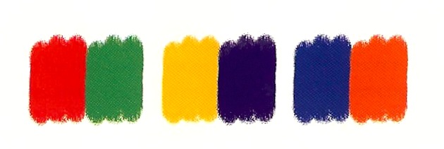
 The complementary color scheme consists of two colors that are opposite each other on the color wheel; that is, they are opposed optically such as red-green, yellow-violet and blue-orange (see figure below).
 This scheme looks best when you place a warm color against a cool color; for example, a red versus green-blue. This scheme is intrinsically high-contrast. Note: Placing a red near a green makes the colors at the shared edge appear more intense; that is, the red appears redder and the green appears greener at the shared edge. This is termed a simultaneous contrast.
Split Complementary Color Scheme
 The split complementary color scheme is a variation of the standard complementary color scheme. It uses a color and the two colors adjacent to its complementary. This provides high contrast without the strong tension of the complementary color scheme.
Triadic Color Scheme
 The triadic color scheme uses three colors equally spaced around the color wheel.
This scheme is popular among artists because it offers strong visual contrast while retaining harmony and color richness. The triadic color scheme is not as contrasting as the complementary scheme, but it looks more balanced and harmonious.
Tetradic (Double Complementary) Color Scheme
 The tetradic (double complementary) color scheme is the most varied because it uses two complementary color pairs.
This scheme is hard to harmonize; if all four hues are used in equal amounts, the scheme may look unbalanced, so you should choose a color to be dominant or to subdue the other colors.
References:
[1] J. Fish, Designing And Printing Textiles, The Crowood Press, Ramsbury (2005).
[2] A. Kornerup and J.H. Wanscher, Methuen Handbook Of Color, Polotokens, Forlag, Copenhagen (1978).
This is the seventh post in the "Art Resource" series, specifically aimed to construct an appropriate knowledge base in order to develop an artistic voice in ArtCloth.
Other posts in this series are:
Glossary of Cultural and Architectural Terms
Units Used in Dyeing and Printing of Fabrics
Occupational, Health & Safety
A Brief History of Color
The Nature of Color
Psychology of Color
Color Schemes
The Naming of Colors
The Munsell Color Classification System
Methuen Color Index and Classification System
The CIE System
Pantone - A Modern Color Classification System
Optical Properties of Fiber Materials
General Properties of Fiber Polymers and Fibers - Part I
General Properties of Fiber Polymers and Fibers - Part II
General Properties of Fiber Polymers and Fibers - Part III
General Properties of Fiber Polymers and Fibers - Part IV
General Properties of Fiber Polymers and Fibers - Part V
Protein Fibers - Wool
Protein Fibers - Speciality Hair Fibers
Protein Fibers - Silk
Protein Fibers - Wool versus Silk
Timelines of Fabrics, Dyes and Other Stuff
Cellulosic Fibers (Natural) - Cotton
Cellulosic Fibers (Natural) - Linen
Other Natural Cellulosic Fibers
General Overview of Man-Made Fibers
Man-Made Cellulosic Fibers - Viscose
Man-Made Cellulosic Fibers - Esters
Man-Made Synthetic Fibers - Nylon
Man-Made Synthetic Fibers - Polyester
Man-Made Synthetic Fibers - Acrylic and Modacrylic
Man-Made Synthetic Fibers - Olefins
Man-Made Synthetic Fibers - Elastomers
Man-Made Synthetic Fibers - Mineral Fibers
Man Made Fibers - Other Textile Fibers
Fiber Blends
From Fiber to Yarn: Overview - Part I
From Fiber to Yarn: Overview - Part II
Melt-Spun Fibers
Characteristics of Filament Yarn
Yarn Classification
Direct Spun Yarns
Textured Filament Yarns
Fabric Construction - Felt
Fabric Construction - Nonwoven fabrics
A Fashion Data Base
Fabric Construction - Leather
Fabric Construction - Films
Glossary of Colors, Dyes, Inks, Pigments and Resins
Fabric Construction – Foams and Poromeric Material
Knitting
Hosiery
Glossary of Fabrics, Fibers, Finishes, Garments and Yarns
Weaving and the Loom
Similarities and Differences in Woven Fabrics
The Three Basic Weaves - Plain Weave (Part I)
The Three Basic Weaves - Plain Weave (Part II)
The Three Basic Weaves - Twill Weave
The Three Basic Weaves - Satin Weave
Figured Weaves - Leno Weave
Figured Weaves – Piqué Weave
Figured Fabrics
Glossary of Art, Artists, Art Motifs and Art Movements
Crêpe Fabrics
Crêpe Effect Fabrics
Pile Fabrics - General
Woven Pile Fabrics
Chenille Yarn and Tufted Pile Fabrics
Knit-Pile Fabrics
Flocked Pile Fabrics and Other Pile Construction Processes
Glossary of Paper, Photography, Printing, Prints and Publication Terms
Napped Fabrics – Part I
Napped Fabrics – Part II
Double Cloth
Multicomponent Fabrics
Knit-Sew or Stitch Through Fabrics
Finishes - Overview
Finishes - Initial Fabric Cleaning
Mechanical Finishes - Part I
Mechanical Finishes - Part II
Additive Finishes
Chemical Finishes - Bleaching
Glossary of Scientific Terms
Chemical Finishes - Acid Finishes
Finishes: Mercerization
Finishes: Waterproof and Water-Repellent Fabrics
Finishes: Flame-Proofed Fabrics
Finishes to Prevent Attack by Insects and Micro-Organisms
Other Finishes
Shrinkage - Part I
Shrinkage - Part II
Progressive Shrinkage and Methods of Control
Durable Press and Wash-and-Wear Finishes - Part I
Durable Press and Wash-and-Wear Finishes - Part II
Durable Press and Wash-and-Wear Finishes - Part III
Durable Press and Wash-and-Wear Finishes - Part IV
Durable Press and Wash-and-Wear Finishes - Part V
The General Theory of Dyeing – Part I
The General Theory Of Dyeing - Part II
Natural Dyes
Natural Dyes - Indigo
Mordant Dyes
Premetallized Dyes
Azoic Dyes
Basic Dyes
Acid Dyes
Disperse Dyes
Direct Dyes
Reactive Dyes
Sulfur Dyes
Blends – Fibers and Direct Dyeing
The General Theory of Printing
There are currently eight data bases on this blogspot, namely, the Glossary of Cultural and Architectural Terms, Timelines of Fabrics, Dyes and Other Stuff, A Fashion Data Base, the Glossary of Colors, Dyes, Inks, Pigments and Resins, the Glossary of Fabrics, Fibers, Finishes, Garments and Yarns, Glossary of Art, Artists, Art Motifs and Art Movements, Glossary of Paper, Photography, Printing, Prints and Publication Terms and the Glossary of Scientific Terms, which has been updated to Version 3.5. All data bases will be updated from time-to-time in the future.
If you find any post on this blog site useful, you can save it or copy and paste it into your own "Word" document etc. for your future reference. For example, Safari allows you to save a post (e.g. click on "File", click on "Print" and release, click on "PDF" and then click on "Save As" and release - and a PDF should appear where you have stored it). Safari also allows you to mail a post to a friend (click on "File", and then point cursor to "Mail Contents On This Page" and release). Either way, this or other posts on this site may be a useful Art Resource for you.
The Art Resource series will be the first post in each calendar month. Remember - these Art Resource posts span information that will be useful for a home hobbyist to that required by a final year University Fine-Art student and so undoubtedly, some parts of any Art Resource post may appear far too technical for your needs (skip over those mind boggling parts) and in other parts, it may be too simplistic with respect to your level of knowledge (ditto the skip). The trade-off between these two extremes will mean that Art Resource posts will hopefully be useful in parts to most, but unfortunately may not be satisfying to all!
Color Schemes
There are a number of concepts about color organization but none that will make you a good colorist. Color schemes are descriptions of color relationships, not formulae for using color well. In other words, they are color plans that involve in-built restrictions.
Color schemes are based on the traditional color wheel.

Monochromatic Color Scheme

This scheme looks clean and elegant. Monochromatic colors go well together, producing a soothing effect. The monochromatic scheme is very easy on the eyes, especially with blue or green hues.
Analogous Color Scheme


One color is used as a dominant color while others are used to enrich the scheme. The analogous color scheme is similar to the monochromatic scheme, but offers more nuances.
Complementary Color Scheme

Split Complementary Color Scheme

Triadic Color Scheme

This scheme is popular among artists because it offers strong visual contrast while retaining harmony and color richness. The triadic color scheme is not as contrasting as the complementary scheme, but it looks more balanced and harmonious.
Tetradic (Double Complementary) Color Scheme

This scheme is hard to harmonize; if all four hues are used in equal amounts, the scheme may look unbalanced, so you should choose a color to be dominant or to subdue the other colors.
References:
[1] J. Fish, Designing And Printing Textiles, The Crowood Press, Ramsbury (2005).
[2] A. Kornerup and J.H. Wanscher, Methuen Handbook Of Color, Polotokens, Forlag, Copenhagen (1978).
No comments:
Post a Comment